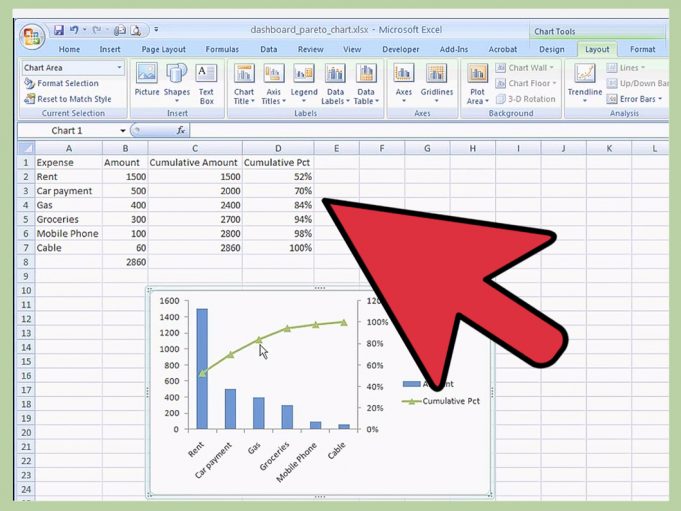
Columns and rows of numbers can be intimidating. The reason is that numbers are abstract things. A number cannot be touched. A number cannot be seen—only a symbol that represents it like “7.” Put enough numbers in one place and many people become confused. However, take those numbers and represent them in a visual manner and the meaning is dramatically clarified.
Selecting a Chart Type in Excel
When selecting a chart type there are several factors that must be considered before choosing a chart type. A simplified personal budget will be used here.
What type of chart should be used? Either a bar or column would be best because there are nearly twenty data points, too many for a pie chart and a line chart could have lines crossing and making the chart harder to interpret.
What should the chart attempt to show? How much money was spent each month in each category?
What data cells should be selected for the chart? A3 through F7 (A3:F7). It contains the expenses for five categories and four months.
Why is the Total column (G3:G7) not part of the selection? If it were included the other elements of the chart would be diminished and could cause a distortion of the real values and differences represented.
Creating the Column Chart in Excel
The creation of a basic chart is straightforward. A significant difference exists in this procedure between Excel 2007 and earlier versions. The first step in both versions is to select the cells by highlighting the items to appear in the chart. If the cells are contiguous, use the mouse pointer (white plus sign), press and hold at A3 as it is dragged to F7. Then release the mouse.
Excel 2007
Click Insert on the Menu Bar.
Click Column. A collection of thumbnails will appear.
Pick the desired Column chart type. Select the 2D Clustered Column Chart. The chart appears on the screen as an object on the current sheet.
Now that the chart has appeared it is time to make more decisions. Note the sizing handles at the corners and middle of chart borders. Chart Tools/Design automatically appears and is selected as soon as the chart type is chosen.
For a quick change to any one of several pre-defined color patterns, click on the More button of the Chart Style ribbon section.
To move the chart to a full sheet of its own click on Move Chart/Location and then pick another pre-existing sheet or a totally new one where the chart should be located.
Choose the More button in the Chart Layout section of the chart ribbon and pick the way you want the chart displayed on the page with title, legend, X and Y axes, etc.
The chart title, and both X and Y axis can be changed by simply clicking one time on the location where they appear in the chart. Ex. Click on “Chart Title” and a text box appears. Simply delete Chart Title and type a new title.
Excel 2003 and Earlier
Click on the Chart Wizard button on the Standard Toolbar. It looks like three vertical bars each in a different color, blue, yellow, and red. A four-step series of dialogue boxes will begin to display.
Select a chart type in step one. Then click “Next.”
A thumbnail of the chart appears on the step two dialogue box asking for verification of series data to appear in chart. If correct, click “Next.”
The third step provides a multitude of options for the chart. Enter chart titles, axes titles, legend placement, and more in this section. When finished click “Next.”
The fourth step asks for location of the finished chart. Should it be placed on a pre-existing sheet or into a new sheet exclusively for its own use? Then click “Finish.”
Changing Chart Data and/or Characteristics After it is Created
The chart and the spreadsheet data are linked within the workbook. If data changes in the spreadsheet, the chart will be readjusted automatically. To make a change to a chart after it has been created (chart type, title, etc.), simply click on the chart or chart sheet. In Excel 2007 to make new choices from the Chart ribbon.
In earlier versions of Excel
Click on Chart in the menu bar.
The first four choices in the drop down menu correspond to the four steps of the Chart Wizard.
Select the appropriate step and make the appropriate changes.
These are the steps to creating a basic chart and require a minimal amount of editing. Become comfortable with basic chart selection procedures before getting involved in aesthetics. Always remember the purpose of the chart is to clarify and simplify the explanation of the many abstract numbers it represents.


